03. août 2020
Comparaison des images dans le monde de Font Antialiasing et ClearType
Image comparison across browsers
Everyone knows the phenomenon that websites are displayed differently depending on the browser. These differences are particularly noticeable between Internet Explorer and Microsoft Edge. You can also see this quite clearly on our homepage, as the following pictures illustrate:
The following text was displayed with Microsoft Edge:

This text was shown with Microsoft Internet Explorer:

Very clearly different – right?
However, this has primarily nothing to do with Antialiasing or ClearType but is in the nature of the rendering engines of the respective browsers. Antialiasing and ClearType of course still play a role, but this would be masked due to the completely different display.
It is immediately apparent that image comparisons are unsuitable here, as the display difference is significant and is visible to the naked eye.
Image comparisons are obviously only suitable to a limited extent here, perhaps with an If/Else construct. However, a Check Text is clearly preferable.
Are image comparisons always useless then?
It is left to the operating system (or additionally to the browser in the case of web tests) to render and display the components (such as buttons, checkboxes, etc.) and text. Image comparisons of "whole" components or components containing text are therefore always difficult and can lead to check errors when tests are executed in different environments.
Generally, every operating system displays components differently. Linux displays buttons, check boxes, and of course also fonts differently than Windows. But even Windows 7 renders differently than Windows 10.
Similarly, versions of Java as well as the graphics card driver used also play a role (especially in the case of font rendering): The browser and its respective version is also crucial for the display of web pages, as shown earlier.
In summary, this means that such image comparisons may fail with any Windows update/upgrade, Java update, graphics card driver update, browser update, or changed user settings.
And not only hardware and software are crucial, but also what respective users will set for themselves personally….
But you have already seen all of this in the introduction above. Topic exhausted? No, we have not even started yet!
Wouldn’t it be “bad” enough that operating systems, graphics card drivers and Java versions play a role in the display? No, we are just getting to the tricky part: Antialiasing and ClearType!
Excursion into theory: Font Antialiasing and ClearType
The topics of Font Antialiasing and ClearType are much more subtle – different settings are often not visible to the naked eye, even though the images (especially around the edges) have virtually no identical color. Most users only notice in a direct comparison whether a text has been modified at all.
These features don’t only affect web applications, but every application.
If you are interested in learning more about this, I recommend the following Wikipedia entries as an introduction:
https://en.wikipedia.org/wiki/Anti-aliasing
https://en.wikipedia.org/wiki/Subpixel_rendering
Back to the practical application
Find all the differences in the following images:


They are identical… or are they?
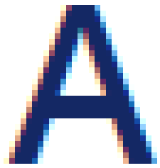
At a first glance, sure, maybe even at the second glance… but have you looked at the details more closely? Tip: if you touch the monitor with your nose (not on a touchscreen), you’ll notice subtle differences, like with the first “A” for example.
Here it is enhanced:


Now you should be able to see the individual pixels (every square corresponds to one logical monitor pixel) and how the edges of the letters are displayed differently. Do you remember the excursion into theory with the Wikipedia entries? If you have skipped over the theory, now is a good time to catch up.
By the way: the only difference that leads to these two results is a minimally changed ClearType setting. Everything else is absolutely identical!
Human eyes first identify the images as identical – QF-Test however immediately recognizes these images as different and thus first protocols an error at this failed image comparison.
In the run-log you can also look at an XOR of the two images and will very quickly see that the images actually differ significantly from each other (XOR highlights color differences depending on the colors; black means no difference).

Antialiasing and ClearType in the user’s hand
With Font Antialiasing and Cleartype, the following settings are of significance, the first four of these depending on user sessions and their respective settings:
- “ClearType“: is adjusted via Windows control panel (cross-application for all applications)
- graphics card driver settings: setting optings depending on the graphics card manufacturer and the driver used (cross-application for all applications)
- Java settings in the Java configuration (found via Windows control panel) (Java applications only)
- Browser settings (browser applications only)
- Java settings via system property or directly as part of the source code of the application (Java applications only)
QF-Test solution
Usually we never recommend verifying text in functional tests by image, we instead recommend an explicit check text node. Also, "whole" components should not be verified by image but by content checks, such as Check Text, Check boolean and so on, see also https://www.qfs.de/en/qf-test-manual/lc/manual-en-checks.html#sec_checks and especially: https://www.qfs.de/en/qf-test-manual/lc/manual-en-checks.html#step_CheckBooleanStep
In case of tests that only differ in relation to Antialiasing and ClearType (i.e. not like the introductory example!) you can also choose to use an image comparison algorithm for the respective check image nodes, for example:
identity;expected=0.91
This means that more than 91% of all pixels need to be absolutely identical, but 9% are allowed to be different – you can intensify or soften this as you wish.
Alternatively, even better for the specific example:
similarity;expected=0.98
Here, a similarity between expected and got color value is calculated for every pixel, and the average of all color values must be 98% identical, which the QF-Test procotol also tells us in the result of the checks:
The images are within tolerance:
 Expected probability: 98.0 %
 Got probability: 98.56 %
You can find more about the algorithms here:
Important to know:
If you have calculated a suitable algorithm, make sure you also check that this algorithm can differentiate clearly between “good enough” and “not good enough”, so that you don’t get any false positive results!
Tip:
You need to input the algorithm manually in the field ‘algorithm for image comparison’. But you can also implement your own checkers and maybe even have different check images in the check input menu, which all differ in the algorithms used – but this is a topic for a different blog post.